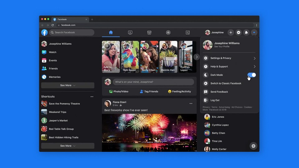
This week we introduced the new Facebook.com. Announced at F8 last year, it will now be the web experience for Facebook globally. It’s faster, easier to use and gives your eyes a break with Dark Mode.
We’ve grown since Facebook.com launched 16 years ago. We’ve built new features, optimized for new devices and operating systems, and expanded to hundreds of languages. Recently we’d focused on the mobile Facebook experience, and realized our desktop site had fallen behind. People need it to keep up.
So we did on-the-ground research, spending months talking to people about how we could make the web experience better for them. Now we’re excited to deliver the new site, a great new foundation for the next decades of Facebook.com.
Find Things Faster
Find what you’re looking for faster with new streamlined navigation: it’s never been easier to find videos, games and Groups, and the home page and page transitions load faster. It’s similar to our mobile experience.
Reduce Glare with Dark Mode
Enjoy lower brightness, alongside contrast and vibrancy, with dark mode. It minimizes screen glare for use in low light, wherever you are.
The new immersive layout along with Dark Mode makes viewing videos on Watch a great experience.
Manage Pages, Groups and Events with Ease
Easily create Events, Pages, Groups and ads on Facebook. Preview a new Group you’re starting in real time, and see what it looks like on mobile before you create it.
The new Facebook.com is simpler and easier to use, with the features you know and love. We’ll keep improving the experience — go to the Settings Menu and click Give Feedback to share feedback.
