By Jeff Smith, Product Designer, Alex Leavitt, User Experience Researcher, and Grace Jackson, User Experience Researcher
When scrolling through News Feed, it’s sometimes difficult to judge the credibility of an article. As with all information on the internet, if we’re unfamiliar with an article’s source or subject matter, it can be hard to come to an informed conclusion about its accuracy.
As the team designing against misinformation on News Feed, we care a lot about giving people the tools to make informed decisions about which stories to read, trust, and share. We recently announced the US launch of a feature that gives people more background on both the publisher and the article. We want to share the process behind this product.
How It Began
The genesis of this feature came out of our work on Related Articles. We learned that showing other content related to a story — for example, reporting from a certified third-party fact-checker — acts as a strong signal to help determine the credibility and accuracy of that story. We wanted to enable people to get similar context across a number of situations, especially when they came across an article in News Feed.
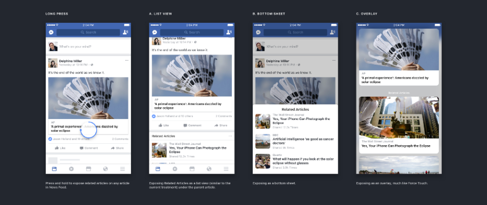
Our early concepts let people press and hold an article to see related content on that story; with that initial concept, we wanted to take a research-driven approach to developing the feature further.
Sprinting to Understand Credibility
People make judgments about a story’s credibility through a wide range of factors. Do they recognize the publisher’s name? How long has the publisher been around? Which of their trusted friends and family also read this source?
As we began to explore other ways to design this feature, we surveyed and spoke to people about how they consumed news and other links on Facebook. We read dozens of academic research papers and grounded our explorations in studies about “source credibility.”
Source credibility is a concept that started in television and newspaper studies in the 1980s and more recently expanded to online content, showing the shift in audiences’ uses of reporters’ style, facial expressions, and choice of topics to judge news content to the ways in which online social systems can provide additional social signals about news-related information.
Understanding perceptions of credibility is complex: factors from publisher familiarity to design features, from message language to individual verification skills, all impact how people determine if an article is high or low quality. We paired our reading on this topic with other research covering how people interpret signals or warnings, how people think about news through political biases such as “selective exposure”, “motivated reasoning”, and more. We also considered recent societal trends like major shifts in perceptions of misinformation (“most Americans believe it is now harder to be well-informed and to determine which news is accurate” Knight Foundation 2018) or trust in the media (“in many countries the underlying drivers of mistrust are as much to do with deep-rooted political polarization and perceived mainstream media bias,” Reuters Institute 2017).
What has been studied less frequently are the kinds of information signals that might work for people on Facebook. How might people respond to particular signals within the design of News Feed? What unique objective information is Facebook best positioned to provide?
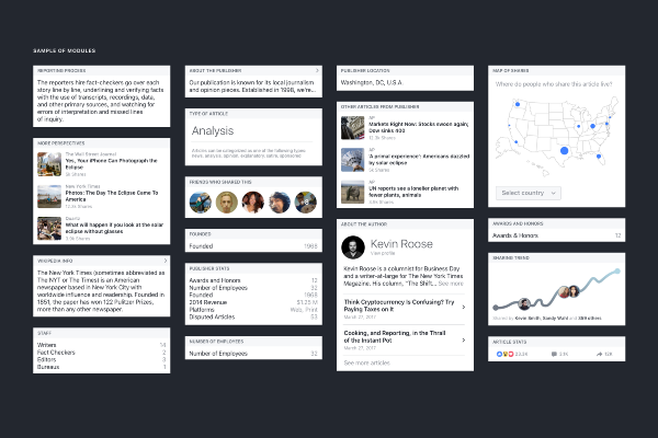
We began to explore these questions through surveys, finding that people encountered difficulty with determining the credibility of information (already-discovered in recent academic research) related in particular to unfamiliar websites and highly partisan content. We then took the next step to explore potential design options through a loose Design Sprint process. Early last year, we gathered a dozen designers and researchers, with whom we collaborated on designing a surface for these new bits of information as well as what that information — segmented into modules — could look like.
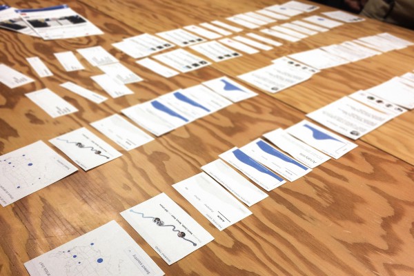
After designing a variety of options, we immediately spoke to and validated with Facebook users in our research lab and in the field, looking at differences in ways that people assessed the information (whether they were high- or low-news consumers, politically ambivalent or partisan, and of various demographic backgrounds). In particular, we conducted semi-structured interviews to learn more about people’s news reading and evaluating habits and card sorts to determine which information modules could be most effective.
Out of Sight, Out of Mind
We know that many people are busy and can be distracted when using Facebook. Many scroll through News Feed on the bus, while taking a break from work, or at home cooking. It’s easy for people to miss details, even important ones. Therefore, a critical challenge with this feature was helping people find the entry point and clearly communicating its value.
Early on, we tested a static entry point with a relatable icon (identified through early interviews). However, we found that people frequently missed the button. After later conducting in-depth interviews with eye-tracking, we learned that — when evaluating articles on Facebook — the same three areas overall tended to draw people’s attention (ordered depending on the individual):
A) The face of the friend, group, or Page who shared the post,
B) Faces (if present) in the article’s preview image, and
C) The headline of the article.
Given this information, we realized that putting the entry point to this feature near the headline would be a more-effective way to engage than on the upper right corner (as originally conceived). We also learned that people adapted quickly, and they were willing and interested in revisiting this space after the first visit, particularly for sources that they were unfamiliar with.
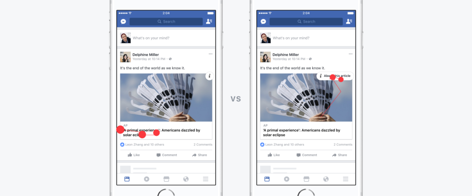
One of the ways we tested making this space even more discoverable was by adding an animation to the entry point, which would activate after dwelling on an article. The animation drew people’s attention… but it had more potential. We conceived of “glimpsing,” or providing a button that:
- Would animate to attract attention, and
- Could also provide additional relevant information.
The animation therefore served to draw a person’s attention and dynamically inform people that both 1) the feature existed, and 2) that there was relevant information that they should care about within the pop-up. As we explore more opportunities for the glimpse, we are considering providing additional, quick signals about the article (for instance, if the article is trending).
Going Global
While we’re starting with just a US launch of these signals, one of the primary concerns we had with this feature was making sure that it could work across cultures, particularly in places where news literacy differed or news ecosystems and markets were more complicated. While this work started with a diverse set of participants in the US, we took this feature around the world to make sure it could work in a variety of settings. In Western Europe, we found that it could play a key role before critical moments like elections, where people were particularly sensitive to the kinds of information that appeared in their News Feed.
People want a quick and easy way to evaluate information in their News Feed, especially something that could replace frequent “look it up on a search engine” behaviors without leaving the Facebook app.
More recently, we conducted fieldwork in Southeast Asia, showing how different local news ecosystems, news markets, and audience behaviors in Indonesia, Myanmar, and the Philippines led to different ways in which people approached gathering more information (for instance, relying more on social signals and comments). It was promising to find that in every market, people were excited to have a tool at their immediate disposal to provide more information about how they could understand the quality of any article.
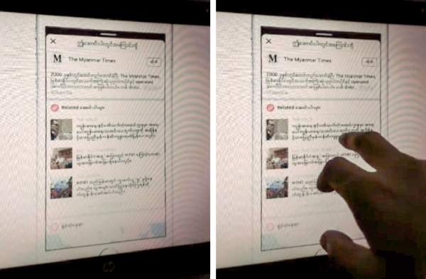
As we’ve explored the potential for this feature internationally, we’ve found some interesting insights. People care deeply about being able to trust the news they see on Facebook. People want a quick and easy way to evaluate information in their News Feed, especially something that could replace frequent “look it up on a search engine” behaviors without leaving the Facebook app. People could use it to triangulate across different types of information to evaluate the credibility of an article, aligning with recent work on “lateral reading” in information literacy. Finally, people wanted to gain more opportunities — and more confidence — in being able to determine the credibility of information they encountered on their own, and this was true on any side of the political spectrum in every single country we visited.
What We’re Launching Now
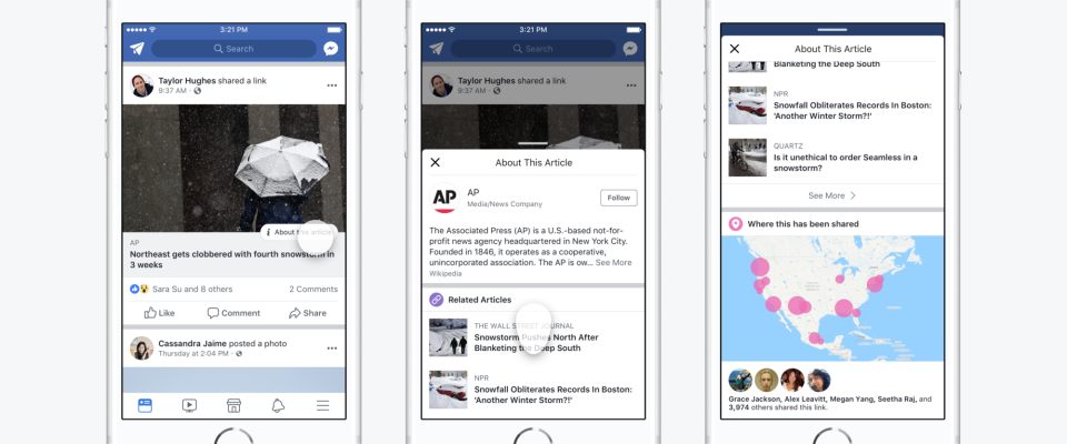
With all of these research insights, we’re launching this feature in the US with 4 important credibility signals:
- Page information: Sometimes people don’t know the source of an article in their News Feed. Showing information about the Page that published the original article lets people get further context on who the publisher is. They can then follow or unfollow the publisher directly from this surface.
- Wikipedia information: Providing context from external experts or third-party organizations is helpful. Wikipedia is a generally trusted encyclopedia with a robust, community-maintained revision process. It also has global recognition, so is a particularly useful feature internationally. Referencing the Wikipedia section about a publisher within the unit gives users a way of getting quick consensus or history on a publisher. Likewise, in our research, the absence of a Wikipedia page was an important credibility cue for users.
- Related articles or more from the publisher: People want to compare information from the same source to see what style of language/wording or selection of topics a publisher covers. Similarly, people can compare the reporting of one publisher to others on a particular event. Much like how we use Related Articles in News Feed, this unit give users another angle on a story and a way to pivot into similar content if they’re interested.
- Share distribution from friends and the Facebook community: Who and how many people share an article — especially when they’re your friends — can be insightful into the background (or bias) of an article. We’ve included the number of shares from across Facebook and which of your friends have shared an article. We’ve also included a map showing where the article was shared to break up an otherwise text-heavy surface and in some cases gives a sense of where the article got the most traction.
There is a lot more we can do with this feature, and a lot more we need to do to roll this out responsibly in other countries. As we continue talking with more people about credibility and learning more about recent research on signals of trust, our focus will be on improving these information modules and integrating it and additional features, into other parts of Facebook.

See also:
Facebook Design (blog)

