by Shali Nguyen, Product Design Manager and Ryan Freitas, Design Director
Every person’s News Feed is different and populated with a unique set of stories — from photos and videos to GIFs and links. And with so many types of stories available, each feed is more complex than ever. In order to make News Feed more conversational and easier to read and navigate, we’ll be making a few updates to its design over the coming weeks.
Better Conversations
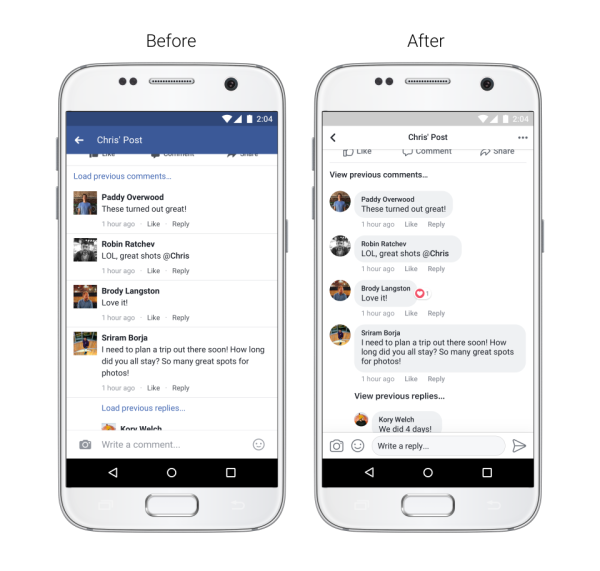
We’re always working to help people have more lively and expressive conversations on Facebook. More and more, comments have become the way to have conversations about a post with other people. We’ve updated our comment style and made it easier to see which comments are direct replies to another person.

Improved Readability
We’re making updates to refresh the look and feel of News Feed, including:
- Increased color contrast so that typography is more legible
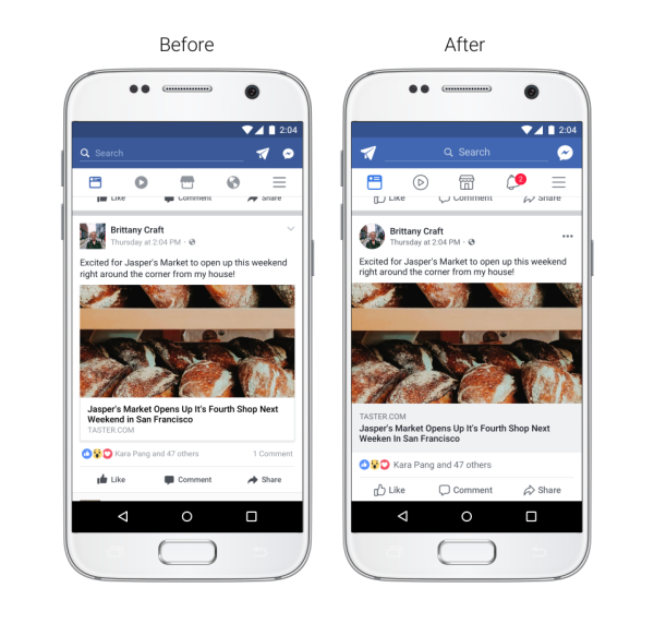
- Larger link previews so everything is easier to read
- Updated icons and Like, Comment, and Share buttons that are larger and easier to tap
- Circular profile pictures to show who’s posting or commenting

Easier Navigation
We wanted to improve how people navigate News Feed to create a more consistent experience. We’re making it easier to:
- See where a link will take you before clicking on it
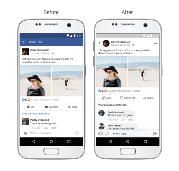
- See whose post you’re commenting on, reacting to, or reading while you’re in the post
- Return to News Feed once you’ve finished reading via a more prominent back button

Will This Impact My Page?
These design updates should not affect Pages’ reach or referral traffic.


