Margaret Gould Stewart is vice president of product design at Facebook, a role she describes as sitting at the “intersection of technology and humanities.” She leads product design and user research teams for emerging technologies such as artificial intelligence and machine learning as well as critical experiences around privacy and data use, among other things. She previously oversaw design efforts for Google Search and YouTube.
Earlier this year, Margaret gave a talk at the SXSW conference on ethics in design. We asked her to tell us a little bit about one slide that really caught our eye.
Designers spend a lot of time thinking about what we’re able to build using the current technology and available resources. We also consider what we’re “allowed” to build. That is, what ladders up to company objectives and is consistent with local policies and regulations.
But we don’t always spend enough time thinking about what we should — and shouldn’t — build.
Given the outsized role that modern technology platforms like Facebook play in society, it’s critical that designers take into account the impact the things we help build can have on people — the good and the bad — and make it a central part of how we approach our work. That’s especially true when we’re designing products that will be used by millions of people, in all parts of the world, likely in ways that we never anticipated.
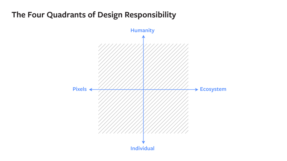
As I think about how to bring ethics into design, I often consider a framework I call the Four Quadrants of Design Responsibility, which you can see below.

On the X-Axis, you have, from left to right, what designers build at an increasing scale, from the single pixel to the bigger product and finally out to the whole ecosystem in which that product operates. As you move from pixel to ecosystem, the constraints, interdependencies and complexities grow.
At the extreme right end of the X-axis, it’s hard to anticipate what will happen when a product begins to interact with a wider and wider ecosystem. Consider a cleaning product that works exceptionally well for a specific task, like scrubbing a kitchen counter — but when released into the water system, may cause harm to plant and animal life. These systems effects may not have been planned, but that doesn’t make them any less real.
On the Y-Axis of the Four Quadrants is the scale of the audience for whom you’re designing, starting with one individual at the bottom and working your way up to all of society on the top.
As you travel along the Y-Axis, a whole set of complexities can arise. As the number of people using your product grows, so does the likelihood that people will use it in unintended ways, creating both good and bad outcomes. People have used Facebook, for example, to organize social-change movements, like the Women’s March. On the other hand, people have also used Facebook to interfere with elections and spread hoaxes.
As designers, we are primarily trained for and tend to feel most comfortable in the bottom left quadrant. It’s where we can push our pixels and focus on our craft. It’s where we can focus on needs at a human level, planning for our products to be used by specific personas who perform pre-determined tasks.
Facebook designers must care about craft and the details in that lower left realm, but designing at a global scale means embracing the responsibility of all four quadrants. We operate at a scale and pace unseen in human history. There are over 2 billion people on the platform — more than the population on earth in 1930. And the platform works differently in different parts of the world, ranging from the way people access the internet and the kinds of devices they have to their social norms, political contexts and economic conditions.
The quadrants remind us that as the scope of our projects grow, we must also expand the framing of our responsibilities. As designers, we spend a lot of time thinking about the “use cases” we want to support. But as we’ve learned through some very hard lessons, we need to spend more time planning for “misuse cases,” when people take tools that are meant to do good and do bad things with them.
Anticipating bad actors and, more generally, bad outcomes is complicated; sometimes it requires the help of outside expertise. For example, people use Facebook’s products to connect with family and friends, and so we are sometimes in a position to recognize and help people experiencing distress and suicidal ideation. We are not experts in suicide prevention, so we conferred extensively with outside experts to make sure the tools and experiences we built were shaped by this expertise.
We also need to make sure that we assess success in ways that are deliberate and nuanced. Recently, we changed one of our core metrics from time spent to meaningful social interactions, which we think better reflects the way we hope people use the platform. And we also continue to balance quantitative data with qualitative insights, so we not only understand what people are doing, but also why.
Designing at Facebook scale is enormously rewarding, and it’s also a huge responsibility. We must remember that all of us — as designers, as businesses, as an industry — have a broad responsibility to ensure that technology is built and deployed in service of humanity, and not the other way around. Designing for all four quadrants, thinking expansively about the impact of our inventions on people and society: these things are at the heart of ethically responsible design.


